برچسب: Android

  • Android Studio Meerkat Feature Drop is stable


    Posted by Adarsh Fernando, Group Product Manager

    Today, we’re excited to announce the stable release of Android Studio Meerkat Feature Drop (2024.3.2)!

    This release brings a host of new features and improvements designed to boost your productivity and enhance your development workflow. With numerous enhancements, this latest release helps you build high-quality Android apps faster and more efficiently: streamlined Jetpack Compose previews, new Gemini capabilities, better Kotlin Multiplatform (KMP) integration, improved device management, and more.

    Read on to learn about the key updates in Android Studio Meerkat Feature Drop, and download the latest stable version today to explore them yourself!

    Developer Productivity Enhancements

    Analyze Crash Reports with Gemini in Android Studio

    Debugging production crashes can require you to spend significant time switching contexts between your crash reporting tool, such as Firebase Crashlytics and Android Vitals, and investigating root causes in the IDE. Now, when viewing reports in App Quality Insights (AQI), click the Insights tab. Gemini provides a summary of the crash, generates insights, and links to useful documentation. If you also provide Gemini with access to local code context, it can provide more accurate results, relevant next steps, and code suggestions. This helps you reduce the time spent diagnosing and resolving issues.

    moving image of Gemini in the App Quality Insights tool window in Android Studio

    Gemini helps you investigate, understand, and resolve crashes in your app much more quickly in the App Quality Insights tool window.

    Generate Unit Test Scenarios with Gemini

    Writing effective unit tests is crucial but can be time-consuming. Gemini now helps kickstart this process by generating relevant test scenarios. Right-click on a class in your editor and select Gemini > Generate Unit Test Scenarios. Gemini analyzes the code and suggests test cases with descriptive names, outlining what to test. While you still implement the specific test logic, this significantly speeds up the initial setup and ensures better test coverage by suggesting scenarios you might have missed.

    moving image of generating unit test scenarios in Android Studio

    Gemini helps you generate unit test scenarios for your app.

    Gemini Prompt Library

    No more retyping your most frequently used prompts for Gemini! The new Prompt Library lets you save prompts directly within Android Studio (Settings > Gemini > Prompt Library). Whether it’s a specific code generation pattern, a refactoring instruction, or a debugging query you use often, save it once from the chat (right-click > Save prompt) and re-apply it instantly from the editor (right-click > Gemini > Prompt Library). Prompts that you save can also be shared and standardized across your team.

    moving image of prompt library in Android Studio

    The prompt library saves your frequently used Gemini prompts to make them easier to use.

    You have the option to store prompts on IDE level or Project level:

      • IDE level prompts are private and can be used across multiple projects.
      • Project level prompts can be shared across teams working on the same project (if .idea folder is added to VCS).

    Compose and UI Development

    Themed Icon Support Preview

    Ensure your app’s branding looks great with Android’s themed icons. Android Studio now lets you preview how your existing launcher icon adapts to the monochromatic theming algorithm directly within the IDE. This quick visual check helps you identify potential contrast issues or undesirable shapes early in the workflow, even before you provide a dedicated monochromatic drawable. This allows for faster iteration on your app’s visual identity.

    moving image of themed icon support in preview in Android Studio

    Themed icon support in Preview helps you visually check how your existing launcher icon adapts to monochromatic theming.

    Compose Preview Enhancements

    Iterating on your Compose UI is now faster and better organized:

      • Enhanced Zoom: Navigate complex layouts more easily with smoother, more responsive zooming in your Compose previews.
      • Collapsible Groups: Tidy up your preview surface by collapsing groups of related composables under their @Preview annotation names, letting you focus on specific parts of the UI without clutter.
      • Grid Mode by Default: Grid mode is now the default for a clear overview. Gallery mode (for flipping through individual previews) is available via right-click, while List view has been removed to streamline the experience.

    moving image of Compose previews in Android Studio

    Compose previews render more smoothly and make it easier to hide previews you’re not focused on.

    Build and Deploy

    KMP Shared Module Integration

    Android Studio now streamlines adding shared logic to your Android app with the new Kotlin Multiplatform Shared Module template. This provides a dedicated starting point within your Android project, making it easier to structure and build shared business logic for both Android and iOS directly from Android Studio.

    Kotlin Multiplatform template in Android Studio

    The new Kotlin Multiplatform module template makes it easier to add shared business logic to your existing app.

    Updated UX for Adding Devices

    Spend less time configuring test devices. The new Device Manager UX for adding virtual and remote devices makes it much easier to configure the devices you want from the Device Manager. To get started, click the ‘+’ action at the top of the window and select one of these options:

      • Create Virtual Device: New filters, recommendations, and creation flow guide you towards creating AVDs that are best suited for your intended purpose and your machine’s performance.
      • Add Remote Devices: With Android Device Streaming, powered by Firebase, you can connect and debug your app with a variety of real physical devices. With a new catalog view and filters, it’s now easier to locate and start using the device you need in just a few clicks.

    moving image of configuring virtual devices in Android Studio

    It’s now easier to configure virtual devices that are optimized for your workstation.

    Google Play Deprecated SDK Warnings

    Stay more informed about SDKs you publish with your app. Android Studio now displays warnings from the Google Play SDK Index when an SDK used in your app has been deprecated by its author. These warnings include information about suggested alternative SDKs, helping you proactively manage dependencies and avoid potential issues related to outdated or insecure libraries.

    Google Play Deprecated SDK warnings in Android Studio

    Play deprecated SDK warnings help you avoid potential issues related to outdated or insecure libraries.

    Updated Build Menu and Actions

    We’ve refined the Build menu for a more intuitive experience:

      • New ‘Build run-configuration-name’ Action: Builds the currently selected run configuration (e.g., :app or a specific test). This is now the default action for the toolbar button and Control/Command+F9.
      • Reordered Actions: The new build action is prioritized at the top, followed by Compile and Assemble actions.
      • Clearer Naming: “Rebuild Project” is now “Clean and Assemble Project with Tests”. “Make Project” is renamed to “Assemble Project”, and a new “Assemble Project with Tests” action is available.

    Build menu in Android Studio

    The Build menu includes behavior and naming changes to simplify and streamline the experience.

    Standardized Config Directories

    Switching between Stable, Beta, and Canary versions of Android Studio is now smoother. Configuration directories are standardized, removing the “Preview” suffix for non-stable builds. We’ve also added the micro version (e.g., AndroidStudio2024.3.2) to the path, allowing different feature drops to run side-by-side without conflicts. This simplifies managing your IDE settings, especially if you work with multiple Android Studio installations.

    IntelliJ platform update

    Android Studio Meerkat Feature Drop (2024.3.2) includes the IntelliJ 2024.3 platform release, which has many new features such as a feature complete K2 mode, more reliable Java** and Kotlin code inspections, grammar checks during indexing, debugger improvements, speed and quality of life improvements to Terminal, and more.

    For more information, read the full IntelliJ 2024.3 release notes.

    Summary

    Android Studio Meerkat Feature Drop (2024.3.2) delivers these key features and enhancements:

      • Developer Productivity:
          • Analyze Crash Reports with Gemini
          • Generate Unit Test Scenarios with Gemini
          • Gemini Prompt Library
      • Compose and UI:
          • Themed Icon Preview
          • Compose Preview Enhancements (Zoom, Collapsible Groups, View Modes)
      • Build and Deploy:
          • KMP Shared Module Template
          • Updated UX for Adding Devices
          • Google Play SDK Insights: Deprecated SDK Warnings
          • Updated Build Menu & Actions
          • Standardized Config Directories
      • IntelliJ Platform Update
          • Feature complete K2 mode
          • Improved Kotlin and Java** inspection reliability
          • Debugger improvements
          • Speed and quality of life improvements in Terminal

    Getting Started

    Ready to elevate your Android development? Download Android Studio Meerkat Feature Drop and start using these powerful new features today!

    As always, your feedback is crucial. Check known issues, report bugs, suggest improvements, and connect with the community on LinkedIn, Medium, YouTube, or X. Let’s continue building amazing Android apps together!

    **Java is a trademark or registered trademark of Oracle and/or its affiliates.


    Source link

  • Concurrency & Networking in Android

    Concurrency & Networking in Android


    Learn iOS, Swift, Android, Kotlin, Flutter and Dart development and unlock our massive
    catalogue of 50+ books and 4,000+ videos.

    Learn more

    © 2025 Kodeco Inc


    Source link

  • There’s good and bad news about the Z Fold and Flip 7 batteries- Android Authority

    There’s good and bad news about the Z Fold and Flip 7 batteries- Android Authority


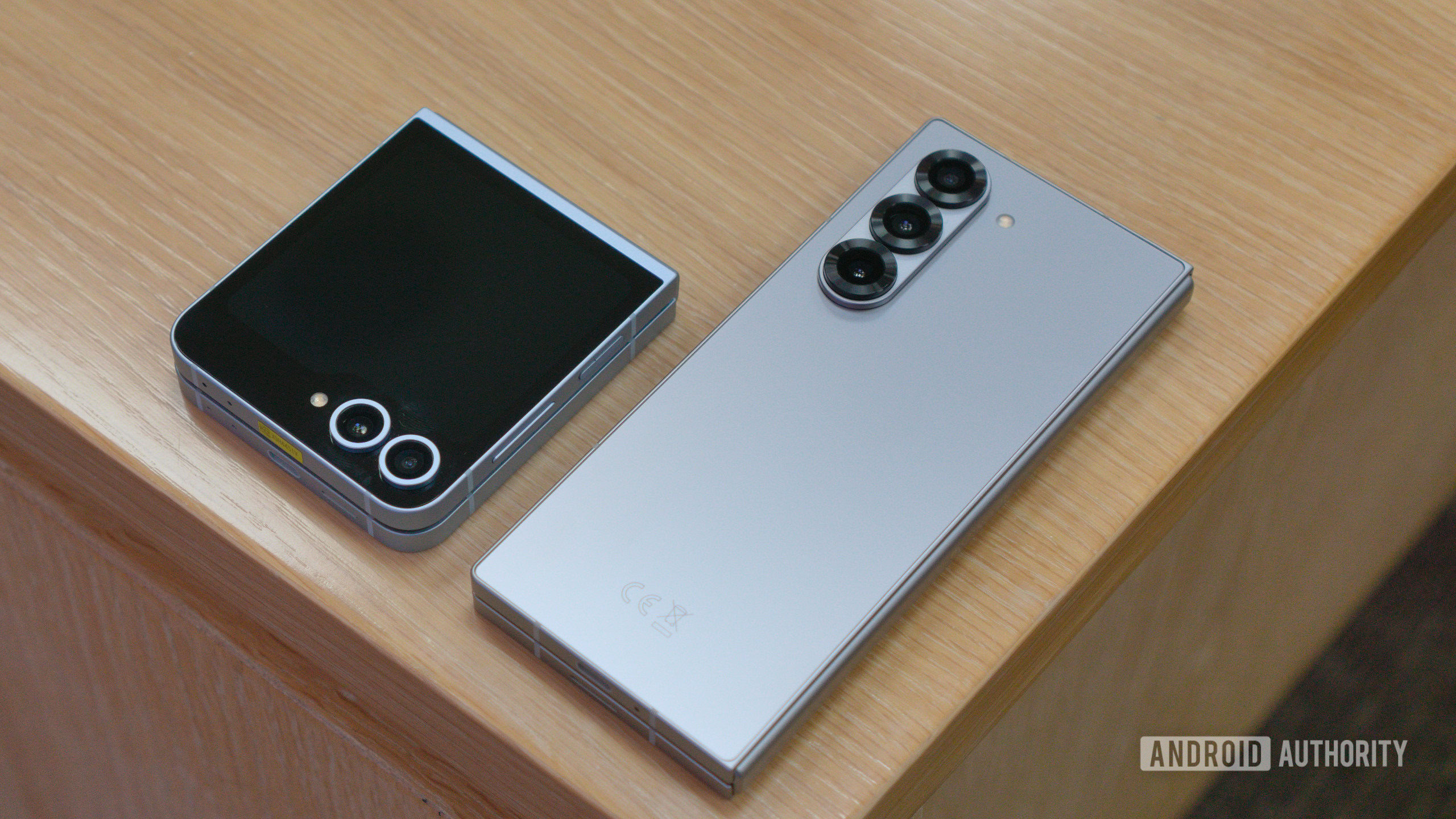
    The Samsung Galaxy Z Flip 6 and Z Fold 6 on a table.

    Hadlee Simons / Android Authority

    TL;DR

    • The batteries for the Galaxy Z Fold 7 and Galaxy Z Flip 7 have received UL Demko certification.
    • The Z Fold 7 would have a total battery capacity of 4,272mAh, while the Z Flip 7 gets 4,174mAh.
    • Both devices may have 25W wireless charging speeds, up from the 15W of previous generations.

    As we get closer to summer, Samsung’s next generation of foldables is looming just over the horizon. We’re anticipating Samsung’s next Galaxy Unpacked event in the first half of July, which may be held in New York for the first time in three years. Here, we should see the Galaxy Z Fold 7 and Z Flip 7 devices, and leaks continue to give us a good idea of what to expect.

    What appear to be the batteries for both the Galaxy Z Fold 7 and Z Flip 7 have received UL Demko certification, which follows their earlier BIS certification, according to TheTechOutlook. Because of this, we now have some solid expectations for the capacities of both batteries.

    For the Galaxy Z Fold 7, we’re looking at possible battery model numbers of EB-BF966ABE and EB-BF967ABE, while these got certificate numbers of DK–163799-UL and DK–163657-UL. These are Li-ion batteries with capacities of 2,126mAh and 2,146mAh, which means 4,272mAh total for the rated capacity. As a comparison, the Galaxy Z Fold 6 packs in 2,355mAh and 1,918mAH batteries, which brings its rated total to 4,273mAh. In terms of marketing, since the Z Fold 6 has a typical 4,400mAh capacity, we should expect something similar for the Z Fold 7 as well.

    Regarding the Z Flip 7, we’ve got model numbers EB-BF766ABE and EB-BF767ABE for the potential batteries here, with certification numbers DK–163399-UL and DK–163928-UL. On this one, the capacities of the batteries are 1,189mAh and 2,985mAh, which would be a total of 4,174mAh. For reference, the Galaxy Z Flip 6’s components were rated at 2,790mAh and 1,097mAh, which is a total of 3,887mAh capacity. The typical capacity for the Z Flip 6 is 4,000mAh, so Samsung may be thinking of positioning this be as 4,300mAh for the Z Flip 7.

    From these new certification listings, those who prefer the larger Galaxy Z Fold series could  see a negligible drop in battery capacity, while the Z Flip fans are likely due a more substantial increase. Of course, actual battery life depends on what you do with your device all day, so these numbers may or may not have a big impact. We’ll find out when the phones launch and we try them out ourselves.

    But there is some good news for both, thankfully. It appears the the next-generation of foldables should support 25W wireless charging, according to their listings in China’s 3C certification database as spotted by TheTechOutlook. However, we also saw that both the Z Fold 7 and Flip 7 might only have 25W wired charging speeds as well, which isn’t as impressive as some of Samsung’s other flagships, and even mid-range devices with 45W.

    We also expect the Galaxy Z Fold 7 and Flip 7 to have Snapdragon 8 Elite SoC and at least 12GB RAM. With just a couple more months before the release of Samsung’s next-generation foldables, we shouldn’t have a much longer wait and will likely see plenty more leaks in the coming weeks.

    Got a tip? Talk to us! Email our staff at news@androidauthority.com. You can stay anonymous or get credit for the info, it’s your choice.


    Source link

  • Android User Interface Development | Kodeco

    Android User Interface Development | Kodeco


    Learn iOS, Swift, Android, Kotlin, Flutter and Dart development and unlock our massive
    catalogue of 50+ books and 4,000+ videos.

    Learn more

    © 2025 Kodeco Inc


    Source link

  • Create a Multiscreen App in Android

    Create a Multiscreen App in Android


    This module covers essential navigation concepts and techniques in Jetpack Compose. You will create a multiscreen movie booking app,
    exploring the Navigation Component, passing arguments between screens, and sharing data with external apps. The course progresses
    to advanced topics like implementing deep links and setting up a bottom navigation bar. Throughout the module, you gain hands-on
    experience with key navigation elements such as the navigation graph, controller, and host, while also learning to handle
    arguments and create a seamless user experience. By the end, you will have a comprehensive understanding of how to implement
    efficient navigation in Jetpack Compose applications.


    Source link

  • Beginning Android & Kotlin | Kodeco

    Beginning Android & Kotlin | Kodeco


    We understand that circumstances can change, and if you need to withdraw from the bootcamp, your options will vary depending on your billing cycle:

    – If you enrolled with a monthly plan, you can cancel your future billing with your membership and you will not be renewed on your next billing date OR you can pause your membership for up to three months, then you can pick up your studies again at that time.

    – If you enrolled with a one-time payment, you will be eligible for a full refund within the first 14 days of your enrollment into the bootcamp.

    *Please note: if you’ve accessed a significant portion of program materials, this might affect your eligibility for a full refund.

    Please email support@kodeco.com for further assistance on the withdrawal process.


    Source link

  • Android Developers Blog: Introducing Widget Quality Tiers


    Posted by Ivy Knight – Senior Design Advocate

    Level up your app Widgets with new quality tiers

    Widgets can be a powerful tool for engaging users and increasing the visibility of your app. They can also help you to improve the user experience by providing users with a more convenient way to access your app’s content and features.

    To build a great Android widget, it should be helpful, adaptive, and visually cohesive with the overall aesthetic of the device home screen.

    In order to help you achieve a great widget, we are pleased to introduce Android Widget Quality Tiers!

    The new Widget quality tiers are here to help guide you towards a best practice implementation of widgets, that will look great and bring your user’s value across the ecosystem of Android Phone, Tablets and Foldables.

    What does this mean for widget makers?

    Whether you are planning a new widget, or investing in an update to an existing widget, the Widget Quality Tiers will help you evaluate and plan for a high quality widget.

    Just like Large Screen quality tiers help optimize app experiences, these Widget tiers guide you in creating great widgets across all Android devices. Now, similar tiers are being introduced for widgets to ensure they’re not just functional, but also visually appealing and user-friendly.

    Two screenshots of a phone display different views in the Google Play app. The first shows a list of running apps with the Widget filter applied in a search for 'Running apps'; the second shows the Nike Run Club app page.

    Widgets that meet quality tier guidelines will be discoverable under the new Widget filter in Google Play.

    Consider using our Canonical Widget layouts, which are based on Jetpack Glance components, to make it easier for you to design and build a Tier 1 widget your users will love.

    Let’s take a look at the Widget Quality Tiers

    There are three tiers built with required system defaults and suggested guidance to create an enhanced widget experience:

    Tier 1: Differentiated

    Four mockups show examples of Material Design 3 dynamic color applied to an app called 'Radio Hour'.

    Differentiated widgets go further by implementing theming and adapting to resizing.

    Tier 1 widgets are exemplary widgets offering hero experiences that are personalized, and create unique and productive homescreens. These widgets meet Tier 2 standards plus enhancements for layout, color, discovery, and system coherence criteria.

    A stylized cartoon figure holds their chin thoughtfully while a chat bubble icon is highlighted

    For example, use the system provided corner radius, and don’t set a custom corner radius on Widgets.

    Add more personalization with dynamic color and generated previews while ensuring your widgets look good across devices by not overriding system defaults.

     Four mockups show examples of Material Design 3 components on Android: a contact card, a podcast player, a task list, and a news feed.

    Tier 1 widgets that, from the top left, properly crop content, fill the layout bounds, have appropriately sized headers and touch targets, and make good use of colors and contrast.

    Tier 2: Quality Standard

    These widgets are helpful, usable, and provide a quality experience. They meet all criteria for layout, color, discovery, and content.

    A simple to-do list app widget displays two tasks: 'Water plants' and 'Water more plants.' Both tasks have calendar icons next to them. The app is titled 'Plants' and has search and add buttons in the top right corner.

    Make sure your widget has appropriate touch targets.

    Tier 2 widgets are functional but simple, they meet the basic criteria for a usable app. But if you want to create a truly stellar experience for your users, tier 1 criteria introduce ways to make a more personal, interactive, and coherent widget.

    Tier 3: Low Quality

    These widgets don’t meet the minimum quality bar and don’t provide a great user experience, meaning they are not following or missing criteria from Tier 2.

     Examples of Material Design 3 widgets are displayed on a light pink background with stylized X shapes. Widgets include a podcast player, a contact card, to-do lists, and a music player.

    Clockwise from the top left not filling the bounds, poorly cropped content, low color contrast, mis-sized header, and small touch targets.

    A stylized cartoon person with orange hair, a blue shirt, holds a pencil to their cheek.  'Kacie' is written above them, with a cut off chat bubble icon.

    For example, ensure content is visible and not cropped

    Build and elevate your Android widgets with Widget Quality Tiers

    Dive deeper into the widget quality tiers and start building widgets that not only look great but also provide an amazing user experience! Check out the official Android documentation for detailed information and best practices.


    This blog post is part of our series: Spotlight Week on Widgets, where we provide resources—blog posts, videos, sample code, and more—all designed to help you design and create widgets. You can read more in the overview of Spotlight Week: Widgets, which will be updated throughout the week.


    Source link

  • Generate stunning visuals in your Android apps with Imagen 3 via Vertex AI in Firebase


    Posted by Thomas Ezan Sr. – Android Developer Relation Engineer (@lethargicpanda)

    Imagen 3, our most advanced image generation model, is now available through Vertex AI in Firebase, making it even easier to integrate it to your Android apps.

    Designed to generate well-composed images with exceptional details, reduced artifacts, and rich lighting, Imagen 3 represents a significant leap forward in image generation capabilities.

    Hot air balloons float over a scenic desert landscape with unique rock formations.

    Image generated by Imagen 3 with prompt: “Shot in the style of DSLR camera with the polarizing filter. A photo of two hot air balloons over the unique rock formations in Cappadocia, Turkey. The colors and patterns on these balloons contrast beautifully against the earthy tones of the landscape below. This shot captures the sense of adventure that comes with enjoying such an experience.”

    A wooden robot stands in a field of yellow flowers, holding a small blue bird on its outstretched hand.

    Image generated by Imagen 3 with prompt: A weathered, wooden mech robot covered in flowering vines stands peacefully in a field of tall wildflowers, with a small blue bird resting on its outstretched hand. Digital cartoon, with warm colors and soft lines. A large cliff with a waterfall looms behind.

    Imagen 3 unlocks exciting new possibilities for Android developers. Generated visuals can adapt to the content of your app, creating a more engaging user experience. For instance, your users can generate custom artwork to enhance their in-app profile. Imagen can also improve your app’s storytelling by bringing its narratives to life with delightful personalized illustrations.

    You can experiment with image prompts in Vertex AI Studio, and learn how to improve your prompts by reviewing the prompt and image attribute guide.

    Get started with Imagen 3

    The integration of Imagen 3 is similar to adding Gemini access via Vertex AI in Firebase. Start by adding the gradle dependencies to your Android project:

    dependencies {
        implementation(platform("com.google.firebase:firebase-bom:33.10.0"))
    
        implementation("com.google.firebase:firebase-vertexai")
    }
    

    Then, in your Kotlin code, create an ImageModel instance by passing the model name and optionally, a model configuration and safety settings:

    val imageModel = Firebase.vertexAI.imagenModel(
      modelName = "imagen-3.0-generate-001",
      generationConfig = ImagenGenerationConfig(
        imageFormat = ImagenImageFormat.jpeg(compresssionQuality = 75),
        addWatermark = true,
        numberOfImages = 1,
        aspectRatio = ImagenAspectRatio.SQUARE_1x1
      ),
      safetySettings = ImagenSafetySettings(
        safetyFilterLevel = ImagenSafetyFilterLevel.BLOCK_LOW_AND_ABOVE
        personFilterLevel = ImagenPersonFilterLevel.ALLOW_ADULT
      )
    )
    

    Finally generate the image by calling generateImages:

    val imageResponse = imageModel.generateImages(
      prompt = "An astronaut riding a horse"
    )
    

    Retrieve the generated image from the imageResponse and display it as a bitmap as follow:

    val image = imageResponse.images.first()
    val uiImage = image.asBitmap()
    

    Next steps

    Explore the comprehensive Firebase documentation for detailed API information.

    Access to Imagen 3 using Vertex AI in Firebase is currently in Public Preview, giving you an early opportunity to experiment and innovate. For pricing details, please refer to the Vertex AI in Firebase pricing page.

    Start experimenting with Imagen 3 today! We’re looking forward to seeing how you’ll leverage Imagen 3’s capabilities to create truly unique, immersive and personalized Android experiences.


    Source link

  • Announcing Android support of digital credentials


    Posted by Rohey Livne – Group Product Manager

    In today’s interconnected world, managing digital identity is essential. Android aims to support open standards that ensure seamless interoperability with various identity providers and services. As part of this goal, we are excited to announce that Android, via Credential Manager’s DigitalCredential API, now natively supports OpenID4VP and OpenID4VCI for digital credential presentation and issuance respectively.

    What are digital credentials?

    Digital credentials are cryptographically verifiable documents. The most common emerging use case for digital credentials is identity documents such as driver’s licenses, passports, or national ID cards. In the coming years, it is anticipated that Android developers will develop innovative applications of this technology for a wider range of personal credentials that users will need to present digitally, including education certifications, insurance policies, memberships, permits, and more.

    Digital credentials can be provided by any installed Android app. These apps are known as “credential holders”; typically digital wallet apps such as Google Wallet or Samsung Wallet.

    Other apps not necessarily thought of as “wallets” may also have a use for exposing a digital credential. For example an airline app might want to offer their users’ air miles reward program membership as a digital credential to be presented to other apps or websites.

    Digital credentials can be presented by the user to any other app or website on the same device, and Android also supports securely presenting Digital Credentials between devices using the same industry standard protocols used by passkeys (CTAP), by establishing encrypted communication tunnels.

    Users can store multiple credentials across multiple apps on their device. By leveraging OpenID4VP requests from websites using the W3C Digital Credential API, or from native apps using Android Credential Manager API, a user can select what credential to present from across all available credentials across all installed digital wallet apps.

    How digital credentials work

    Presentation

    To present the credential, the verifier sends an OpenID4VP request to the Digital Credential API, which then prompts the user to select a credential across all the credentials that can satisfy this request. Note that the user is selecting a credential, not a digital wallet app:

    Digital credentials selection interface on a mobile device

    Digital credentials selection interface

    Once the user chooses a credential to proceed with, Android platform redirects the original OpenID4VP request to the digital wallet app that holds the chosen credential to complete the presentation back to the verifier. When the digital wallet app receives the OpenID4VP request from Android, it can also perform any additional due-diligence steps it needs to perform prior to releasing the credential to the verifier.

    Issuance

    Android also allows developers to issue their own Digital Credentials to a user’s digital wallet app. This process can be done using an OpenID4VCI request, which prompts the user to choose the digital wallet app that they want to store the credential in. Alternatively, the issuance could be done directly from within the digital wallet app (some apps might not even have an explicit user facing issuance step if they store credentials based on their association to a signed-in user account).

    a single credential in a user's digital wallet app

    A wallet app holds a single credential

    Over time, the user can repeat this process to issue multiple credentials across multiple digital wallet apps:

    multiple credentials in multiple digital wallets held by a single user

    Multiple wallet apps hold multiple credentials

    Note: To ensure that at presentation time Android can appropriately list all the credentials that digital wallet apps hold, digital wallets must register their credentials’ metadata with Credential Manager. Credential Manager uses this metadata to match credentials across available digital wallet apps to the verifier’s request, so that it can only present a list of valid credentials that can satisfy the request for the user to select from.

    Early adopters

    As Google Wallet announced yesterday, soon users will be able to use digital credentials to recover Amazon accounts, access online health services with CVS and MyChart by Epic, and verify profiles or identity on platforms like Uber and Bumble.

    These use cases will take advantage of users’ digital credentials stored in any digital wallet app users have on their Android device. To that end, we’re also happy to share that both Samsung Wallet and 1Password will hold users’ digital credentials as digital wallets and support OpenID standards via Android’s Credential Manager API.

    Learn more

    Credential Manager API lets every Android app implement credential verification or provide credentials on the Android platform.

    Check out our new digital credential documentation on how to become a credential verifier, taking advantage of users’ existing digital credentials using Jetpack Credential Manager, or to become a digital wallet app holding your own credentials for other apps or websites to verify.


    Source link

  • Multimodal image attachment is now available for Gemini in Android Studio


    Posted by Paris Hsu – Product Manager, Android Studio

    At every stage of the development lifecycle, Gemini in Android Studio has become your AI-powered companion, making it easier to build high quality apps. We are excited to announce a significant expansion: Gemini in Android Studio now supports multimodal inputs, which lets you attach images directly to your prompts! This unlocks a wealth of new possibilities that improve team collaboration and UI development workflows.

    You can try out this new feature by downloading the latest Android Studio canary. We’ve outlined a few use cases to try, but we’d love to hear what you think as we work through bringing this feature into future stable releases. Check it out:

    https://www.youtube.com/watch?v=f_6mtRWJzuc

    Image attachment – a new dimension of interaction

    We first previewed Gemini’s multimodal capabilities at Google I/O 2024. This technology allows Gemini in Android Studio to understand simple wireframes, and transform them into working Jetpack Compose code.

    You’ll now find an image attachment icon in the Gemini chat window. Simply attach JPEG or PNG files to your prompts and watch Gemini understand and respond to visual information. We’ve observed that images with strong color contrasts yield the best results.

    New “Attach Image File” icon in chat window

    1.1 New “Attach Image File” icon in chat window

    Example of multimodal response in chat

    1.2 Example multimodal response in chat

    We encourage you to experiment with various prompts and images. Here are a few compelling use cases to get you started:

      • Rapid UI prototyping and iteration: Convert a simple wireframe or high-fidelity mock of your app’s UI into working code.
      • Diagram explanation and documentation: Gain deeper insights into complex architecture or data flow diagrams by having Gemini explain their components and relationships.
      • UI troubleshooting: Capture screenshots of UI bugs and ask Gemini for solutions.

    Rapid UI prototyping and iteration

    Gemini’s multimodal support lets you convert visual designs into functional UI code. Simply upload your image and use a clear prompt. It works whether you’re working from your own sketches or from a designer mockup.

    Here’s an example prompt: “For this image provided, write Android Jetpack Compose code to make a screen that’s as close to this image as possible. Make sure to include imports, use Material3, and document the code.” And then you can append any specific or additional instructions related to the image.

    Example prompt: 'For this image provided, write Android Jetpack Compose code to make a screen that's as close to this image as possible. Make sure to include imports, use Material3, and document the code.'

    Example of generating Compose code from high-fidelity mock using Gemini in Android Studio

    2. Example of generating Compose code from high-fidelity mock using Gemini in Android Studio (code output)

    For more complex UIs, refine your prompts to capture specific functionality. For instance, when converting a calculator mockup, adding “make the interactions and calculations work as you’d expect” results in a fully functional calculator:

    Example prompt to convert a calculator mock up

    Example of generating Compose code from high-fidelity mock using Gemini in Android Studio

    3. Example of generating Compose code from wireframe via Gemini in Android Studio (code output)

    Note: this feature provides an initial design scaffold. It’s a good “first draft” and your edits and adjustments will be needed. Common refinements include ensuring correct drawable imports and importing icons. Consider the generated code a highly efficient starting point, accelerating your UI development workflow.

    Diagram explanation and documentation

    With Gemini’s multimodal capabilities, you can also try uploading an image of your diagram and ask for explanations or documentation.

    Example prompt: Upload the Now in Android architecture diagram and say “Explain the components and data flow in this diagram” or “Write documentation about this diagram”.

    Example of generating Compose code from high-fidelity mock using Gemini in Android Studio

    4. Example of asking Gemini to help document the NowInAndroid architecture diagram

    UI troubleshooting

    Leverage Gemini’s visual analysis to identify and resolve bugs quickly. Upload a screenshot of the problematic UI, and Gemini will analyze the image and suggest potential solutions. You can also include relevant code snippets for more precise assistance.

    In the example below, we used Compose UI check and found that the button is stretched too wide in tablet screens, so we took a screenshot and asked Gemini for solutions – it was able to leverage the window size classes to provide the right fix.

    Example of generating Compose code from high-fidelity mock using Gemini in Android Studio

    5. Example of fixing UI bugs using Image Attachment (code output)

    Download Android Studio today

    Download the latest Android Studio canary today to try the new multimodal features!

    As always, Google is committed to the responsible use of AI. Android Studio won’t send any of your source code to servers without your consent. You can read more on Gemini in Android Studio’s commitment to privacy.

    We appreciate any feedback on things you like or features you would like to see. If you find a bug, please report the issue and also check out known issues. Remember to also follow us on X, Medium, or YouTube for more Android development updates!


    Source link