برچسب: New

  • What’s New in Jetpack Compose


    Posted by Nick Butcher – Product Manager

    At Google I/O 2025, we announced a host of features, performance, stability, libraries, and tools updates for Jetpack Compose, our recommended Android UI toolkit. With Compose you can build excellent apps that work across devices. Compose has matured a lot since it was first announced (at Google I/O 2019!) and we’re now seeing 60% of the top 1,000 apps in the Play Store such as MAX and Google Drive use and love it.

    New Features

    Since I/O last year, Compose Bill of Materials (BOM) version 2025.05.01 adds new features such as:

      • Autofill support that lets users automatically insert previously entered personal information into text fields.
      • Auto-sizing text to smoothly adapt text size to a parent container size.
      • Visibility tracking for when you need high-performance information on a composable’s position in its root container, screen, or window.
      • Animate bounds modifier for beautiful automatic animations of a Composable’s position and size within a LookaheadScope.
      • Accessibility checks in tests that let you build a more accessible app UI through automated a11y testing.

    LookaheadScope {
        Box(
            Modifier
                .animateBounds(this@LookaheadScope)
                .width(if(inRow) 100.dp else 150.dp)
                .background(..)
                .border(..)
        )
    }
    

    moving image of animate bounds modifier in action

    For more details on these features, read What’s new in the Jetpack Compose April ’25 release and check out these talks from Google I/O:

    If you’re looking to try out new Compose functionality, the alpha BOM offers new features that we’re working on including:

      • Pausable Composition (see below)
      • Updates to LazyLayout prefetch
      • Context Menus
      • New modifiers: onFirstVisible, onVisbilityChanged, contentType
      • New Lint checks for frequently changing values and elements that should be remembered in composition

    Please try out the alpha features and provide feedback to help shape the future of Compose.

    Material Expressive

    At Google I/O, we unveiled Material Expressive, Material Design’s latest evolution that helps you make your products even more engaging and easier to use. It’s a comprehensive addition of new components, styles, motion and customization options that help you to build beautiful rich UIs. The Material3 library in the latest alpha BOM contains many of the new expressive components for you to try out.

    moving image of material expressive design example

    Learn more to start building with Material Expressive.

    Adaptive layouts library

    Developing adaptive apps across form factors including phones, foldables, tablets, desktop, cars and Android XR is now easier with the latest enhancements to the Compose adaptive layouts library. The stable 1.1 release adds support for predictive back gestures for smoother transitions and pane expansion for more flexible two pane layouts on larger screens. Furthermore, the 1.2 (alpha) release adds more flexibility for how panes are displayed, adding strategies for reflowing and levitating.

    moving image of compose adaptive layouts updates in the Google Play app

    Compose Adaptive Layouts Updates in the Google Play app

    Learn more about building adaptive android apps with Compose.

    Performance

    With each release of Jetpack Compose, we continue to prioritize performance improvements. The latest stable release includes significant rewrites and improvements to multiple sub-systems including semantics, focus and text optimizations. Best of all these are available to you simply by upgrading your Compose dependency; no code changes required.

    bar chart of internal benchmarks for performance run on a Pixel 3a device from January to May 2023 measured by jank rate

    Internal benchmark, run on a Pixel 3a

    We continue to work on further performance improvements, notable changes in the latest alpha BOM include:

      • Pausable Composition allows compositions to be paused, and their work split up over several frames.
      • Background text prefetch enables text layout caches to be pre-warmed on a background thread, enabling faster text layout.
      • LazyLayout prefetch improvements enabling lazy layouts to be smarter about how much content to prefetch, taking advantage of pausable composition.

    Together these improvements eliminate nearly all jank in an internal benchmark.

    Stability

    We’ve heard from you that upgrading your Compose dependency can be challenging, encountering bugs or behaviour changes that prevent you from staying on the latest version. We’ve invested significantly in improving the stability of Compose, working closely with the many Google app teams building with Compose to detect and prevent issues before they even make it to a release.

    Google apps develop against and release with snapshot builds of Compose; as such, Compose is tested against the hundreds of thousands of Google app tests and any Compose issues are immediately actioned by our team. We have recently invested in increasing the cadence of updating these snapshots and now update them daily from Compose tip-of-tree, which means we’re receiving feedback faster, and are able to resolve issues long before they reach a public release of the library.

    Jetpack Compose also relies on @Experimental annotations to mark APIs that are subject to change. We heard your feedback that some APIs have remained experimental for a long time, reducing your confidence in the stability of Compose. We have invested in stabilizing experimental APIs to provide you a more solid API surface, and reduced the number of experimental APIs by 32% in the last year.

    We have also heard that it can be hard to debug Compose crashes when your own code does not appear in the stack trace. In the latest alpha BOM, we have added a new opt-in feature to provide more diagnostic information. Note that this does not currently work with minified builds and comes at a performance cost, so we recommend only using this feature in debug builds.

    class App : Application() {
       override fun onCreate() {
            // Enable only for debug flavor to avoid perf impact in release
            Composer.setDiagnosticStackTraceEnabled(BuildConfig.DEBUG)
       }
    }
    

    Libraries

    We know that to build great apps, you need Compose integration in the libraries that interact with your app’s UI.

    A core library that powers any Compose app is Navigation. You told us that you often encountered limitations when managing state hoisting and directly manipulating the back stack with the current Compose Navigation solution. We went back to the drawing-board and completely reimagined how a navigation library should integrate with the Compose mental model. We’re excited to introduce Navigation 3, a new artifact designed to empower you with greater control and simplify complex navigation flows.

    We’re also investing in Compose support for CameraX and Media3, making it easier to integrate camera capture and video playback into your UI with Compose idiomatic components.

    @Composable
    private fun VideoPlayer(
        player: Player?, // from media3
        modifier: Modifier = Modifier
    ) {
        Box(modifier) {
            PlayerSurface(player) // from media3-ui-compose
            player?.let {
                // custom play-pause button UI
                val playPauseButtonState = rememberPlayPauseButtonState(it) // from media3-ui-compose
                MyPlayPauseButton(playPauseButtonState, Modifier.align(BottomEnd).padding(16.dp))
            }
        }
    }
    

    To learn more, see the media3 Compose documentation and the CameraX samples.

    Tools

    We continue to improve the Android Studio tools for creating Compose UIs. The latest Narwhal canary includes:

      • Resizable Previews instantly show you how your Compose UI adapts to different window sizes
      • Preview navigation improvements using clickable names and components
      • Studio Labs 🧪: Compose preview generation with Gemini quickly generate a preview
      • Studio Labs 🧪: Transform UI with Gemini change your UI with natural language, directly from preview.
      • Studio Labs 🧪: Image attachment in Gemini generate Compose code from images.

    For more information read What’s new in Android development tools.

    moving image of resizable preview in Jetpack Compose

    Resizable Preview

    New Compose Lint checks

    The Compose alpha BOM introduces two new annotations and associated lint checks to help you to write correct and performant Compose code. The @FrequentlyChangingValue annotation and FrequentlyChangedStateReadInComposition lint check warns in situations where function calls or property reads in composition might cause frequent recompositions. For example, frequent recompositions might happen when reading scroll position values or animating values. The @RememberInComposition annotation and RememberInCompositionDetector lint check warns in situations where constructors, functions, and property getters are called directly inside composition (e.g. the TextFieldState constructor) without being remembered.

    Happy Composing

    We continue to invest in providing the features, performance, stability, libraries and tools that you need to build excellent apps. We value your input so please share feedback on our latest updates or what you’d like to see next.

    Explore this announcement and all Google I/O 2025 updates on io.google starting May 22.


    Source link

  • What’s new in Watch Faces


    Posted by Garan Jenkin – Developer Relations Engineer

    Wear OS has a thriving watch face ecosystem featuring a variety of designs that also aims to minimize battery impact. Developers have embraced the simplicity of creating watch faces using Watch Face Format – in the last year, the number of published watch faces using Watch Face Format has grown by over 180%*.

    Today, we’re continuing our investment and announcing version 4 of the Watch Face Format, available as part of Wear OS 6. These updates allow developers to express even greater levels of creativity through the new features we’ve added. And we’re supporting marketplaces, which gives flexibility and control to developers and more choice for users.

    In this blog post we’ll cover key new features, check out the documentation for more details of changes introduced in recent versions.

    Supporting marketplaces with Watch Face Push

    We’re also announcing a completely new API, the Watch Face Push API, aimed at developers who want to create their own watch face marketplaces.

    Watch Face Push, available on devices running Wear OS 6 and above, works exclusively with watch faces that use the Watch Face Format watch faces.

    We’ve partnered with well-known watch face developers – including Facer, TIMEFLIK, WatchMaker, Pujie, and Recreative – in designing this new API. We’re excited that all of these developers will be bringing their unique watch face experiences to Wear OS 6 using Watch Face Push.

    Three mobile devices representing watch face marketplace apps for watches running Wear OS 6

    From left to right, Facer, Recreative and TIMEFLIK watch faces have been developing marketplace apps to work with watches running Wear OS 6.

    Watch faces managed and deployed using Watch Face Push are all written using Watch Face Format. Developers publish these watch faces in the same way as publishing through Google Play, though there are some additional checks the developer must make which are described in the Watch Face Push guidance.

    A flow diagram demonstrating the flow of information from Cloud-based storage to the user's phone where the app is installed, then transferred to be installed on a wearable device using the Wear OS App via the Watch Face Push API

    The Watch Face Push API covers only the watch part of this typical marketplace system diagram – as the app developer, you have control and responsibility for the phone app and cloud components, as well as for building the Wear OS app using Watch Face Push. You’re also in control of the phone-watch communications, for which we recommend using the Data Layer APIs.

    Adding Watch Face Push to your project

    To start using Watch Face Push on Wear OS 6, include the following dependency in your Wear OS app:

    // Ensure latest version is used by checking the repository
    implementation("androidx.wear.watchface:watchface-push:1.3.0-alpha07")
    

    Declare the necessary permission in your AndroidManifest.xml:

    <uses-permission android:name="com.google.wear.permission.PUSH_WATCH_FACES" />
    

    Obtain a Watch Face Push client:

    val manager = WatchFacePushManagerFactory.createWatchFacePushManager(context)
    

    You’re now ready to start using the Watch Face Push API, for example to list the watch faces you have already installed, or add a new watch face:

    // List existing watch faces, installed by this app
    val listResponse = manager.listWatchFaces()
    
    // Add a watch face
    manager.addWatchFace(watchFaceFileDescriptor, validationToken)
    

    Understanding Watch Face Push

    While the basics of the Watch Face Push API are easy to understand and access through the WatchFacePushManager interface, it’s important to consider several other factors when working with the API in practice to build an effective marketplace app, including:

      • Setting active watch faces – Through an additional permission, the app can set the active watch face. Learn about how to integrate this feature, as well as how to handle the different permission scenarios.

    To learn more about using Watch Face Push, see the guidance and reference documentation.

    Updates to Watch Face Format

    Photos

    Available from Watch Face Format v4

    The new Photos element allows the watch face to contain user-selectable photos. The element supports both individual photos and a gallery of photos. For a gallery of photos, developers can choose whether the photos advance automatically or when the user taps the watch face.

    a wearable device and small screen mobile device side by side demonstrating how a user may configure photos for the watch face through the Companion app on the mobile device

    Configuring photos through the watch Companion app

    The user is able to select the photos of their choice through the companion app, making this a great way to include true personalization in your watch face. To use this feature, first add the necessary configuration:

    <UserConfigurations>
      <PhotosConfiguration id="myPhoto" configType="SINGLE"/>
    </UserConfigurations>
    

    Then use the Photos element within any PartImage, in the same way as you would for an Image element:

    <PartImage ...>
      <Photos source="[CONFIGURATION.myPhoto]"
              defaultImageResource="placeholder_photo"/>
    </PartImage>
    

    For details on how to support multiple photos, and how to configure the different change behaviors, refer to the Photos section of the guidance and reference, as well as the GitHub samples.

    Transitions

    Available from Watch Face Format v4

    Watch Face Format now supports transitions when exiting and entering ambient mode.

    moving image demonstrating an overshoot effect adjusting the time on a watch face to reveal the seconds digit

    State transition animation: Example using an overshoot effect in revealing the seconds digits

    This is achieved through the existing Variant tag. For example, the hours and minutes in the above watch face are animated as follows:

    <DigitalClock ...>
      <Variant mode="AMBIENT" target="x" value="100" interpolation="OVERSHOOT" />
    
       <!-- Rest of "hh:mm" clock definition here -->
    </DigitalClock>
    

    By default, the animation takes the full extent of allowed time for the transition. The new interpolation attribute controls the animation effect – in this case the use of OVERSHOOT adds a playful experience.

    The seconds are implemented in a separate DigitalClock element, which shows the use of the new duration attribute:

    <DigitalClock ...>
      <Variant mode="AMBIENT" target="alpha" value="0" duration="0.5"/>
       <!-- Rest of "ss" clock definition here -->
    </DigitalClock>
    

    The duration attribute takes a value between 0.0 and 1.0, with 1.0 representing the full extent of the allowed time. In this example, by using a value of 0.5, the seconds animation is quicker – taking half the allowed time, in comparison to the hours and minutes, which take the entire transition period.

    For more details on using transitions, see the guidance documentation, as well as the reference documentation for Variant.

    Color Transforms

    Available from Watch Face Format v4

    We’ve extended the usefulness of the Transform element by allowing color to be transformed on the majority of elements where it is an attribute, and also allowing tintColor to be transformed on Group and Part* elements such as PartDraw and PartText.

    The main exceptions to this addition are the clock elements, DigitalClock and AnalogClock, and also ComplicationSlot, which do not currently support Transform.

    In addition to extending the list of transformable attributes to include colors, we’ve also added a handful of useful functions for manipulating color:

    To see these in action, let’s consider an example.

    The Weather data source provides the current UV index through [WEATHER.UV_INDEX]. When representing the UV index, these values are typically also assigned a color:

    moving image demonstrating an overshoot effect adjusting the time on a watch face to reveal the seconds digit

    We want to represent this information as an Arc, not only showing the value, but also using the appropriate color. We can achieve this as follows:

    <Arc centerX="0" centerY="0" height="420" width="420"
      startAngle="165" endAngle="165" direction="COUNTER_CLOCKWISE">
      <Transform target="endAngle"
        value="165 - 40 * (clamp(11, 0.0, 11.0) / 11.0)" />
      <Stroke thickness="20" color="#ffffff" cap="ROUND">
        <Transform target="color"
          value="extractColorFromWeightedColors(#97d700 #FCE300 #ff8200 #f65058 #9461c9, 3 3 2 3 1, false, clamp([WEATHER.UV_INDEX] + 0.5, 0.0, 12.0) / 12.0)" />
      </Stroke>
    </Arc>
    

    Let’s break this down:

      • The first Transform restricts the UV index to the range 0.0 to 11.0 and adjusts the sweep of the Arc according to that value.
      • The second Transform uses the new extractColorFromWeightedColors function.
          • The first argument is our list of colors
          • The second argument is a list of weights – you can see from the chart above that green covers 3 values, whereas orange only covers 2, so we use weights to represent this.
          • The third argument is whether or not to interpolate the color values. In this case we want to stick strictly to the color convention for UV index, so this is false.
          • Finally in the fourth argument we coerce the UV value into the range 0.0 to 1.0, which is used as an index into our weighted colors.

    The result looks like this:

    side by side quadrants of watch face examples showing using the new color functions in applying color transforms to a Stroke in an Arc

    Using the new color functions in applying color transforms to a Stroke in an Arc.

    As well as being able to provide raw colors and weights to these functions, they can also be used with values from complications, such as HR, temperature or steps goal. For example, to use the color range specified in a goal complication:

    <Transform target="color"
        value="extractColorFromColors(
            [COMPLICATION.GOAL_PROGRESS_COLORS],
            [COMPLICATION.GOAL_PROGRESS_COLOR_INTERPOLATE],
            [COMPLICATION.GOAL_PROGRESS_VALUE] /    
                [COMPLICATION.GOAL_PROGRESS_TARGET_VALUE]
    )"/>
    

    Introducing the Reference element

    Available from Watch Face Format v4

    The new Reference element allows you to refer to any transformable attribute from one part of your watch face scene in other parts of the scene tree.

    In our UV index example above, we’d also like the text labels to use the same color scheme.

    We could perform the same color transform calculation as on our Arc, using [WEATHER.UV_INDEX], but this is duplicative work which could lead to inconsistencies, for example if we change the exact color hues in one place but not the other.

    Returning to the Arc definition, let’s create a Reference to the color:

    <Arc centerX="0" centerY="0" height="420" width="420"
      startAngle="165" endAngle="165" direction="COUNTER_CLOCKWISE">
      <Transform target="endAngle"
        value="165 - 40 * (clamp(11, 0.0, 11.0) / 11.0)" />
      <Stroke thickness="20" color="#ffffff" cap="ROUND">
        <Reference source="color" name="uv_color" defaultValue="#ffffff" />
        <Transform target="color"
          value="extractColorFromWeightedColors(#97d700 #FCE300 #ff8200 #f65058 #9461c9, 3 3 2 3 1, false, clamp([WEATHER.UV_INDEX] + 0.5, 0.0, 12.0) / 12.0)" />
      </Stroke>
    </Arc>
    

    The color of the Arc is calculated from the relatively complex extractColorFromWeightedColors function. To avoid repeating this elsewhere in our watch face, we have added a Reference element, which takes as its source the Stroke color.

    Let’s now look at how we can consume this value in a PartText elsewhere in the watch face. We gave the Reference the name uv_color, so we can simply refer to this in any expression:

    <PartText x="0" y="225" width="450" height="225">
      <TextCircular centerX="225" centerY="0" width="420" height="420"
        startAngle="120" endAngle="90"
        align="START" direction="COUNTER_CLOCKWISE">
        <Font family="SYNC_TO_DEVICE" size="24">
          <Transform target="color" value="[REFERENCE.uv_color]" />
          <Template>%d<Parameter expression="[WEATHER.UV_INDEX]" /></Template>
        </Font>
      </TextCircular>
    </PartText>
    <!-- Similar PartText here for the "UV:" label -->
    

    As a result, the color of the Arc and the UV numeric value are now coordinated:

    side by side quadrants of watch face examples showing Coordinating colors across elements using the Reference element

    Coordinating colors across elements using the Reference element

    For more details on how to use the Reference element, refer to the Reference guidance.

    Text autosizing

    Available from Watch Face Format v3

    Sometimes the exact length of the text to be shown on the watch face can vary, and as a developer you want to balance being able to display text that is both legible, but also complete.

    Auto-sizing text can help solve this problem, and can be enabled through the isAutoSize attribute introduced to the Text element:

    <Text align="CENTER" isAutoSize="true">
    

    Having set this attribute, text will then automatically fit the available space, starting at the maximum size specified in your Font element, and with a minimum size of 12.

    As an example, step count could range from tens or hundreds through to many thousands, and the new isAutoSize attribute enables best use of the available space for every possible value:

    side by side examples of text sizing adjustments on watch face using isAutosize

    Making the best use of the available text space through isAutoSize

    For more details on isAutoSize, see the Text reference.

    Android Studio support

    For developers working in Android Studio, we’ve added support to make working with Watch Face Format easier, including:

      • Run configuration support
      • Auto-complete and resource reference
      • Lint checking

    This is available from Android Studio Canary version 2025.1.1 Canary 10.

    Learn More

    To learn more about building watch faces, please take a look at the following resources:

    We’ve also recently launched a codelab for Watch Face Format and have updated samples on GitHub to showcase new features. The issue tracker is available for providing feedback.

    We’re excited to see the watch face experiences that you create and share!

    Explore this announcement and all Google I/O 2025 updates on io.google starting May 22.

    * Google Play data for period 2025-03-24 to 2025-03-23


    Source link

  • What’s new in Wear OS 6


    Posted by Chiara Chiappini – Developer Relations Engineer

    This year, we’re excited to introduce Wear OS 6: the most power-efficient and expressive version of Wear OS yet.

    Wear OS 6 introduces the new design system we call Material 3 Expressive. It features a major refresh with visual and motion components designed to give users an experience with more personalization. The new design offers a great level of expression to meet user demand for experiences that are modern, relevant, and distinct. Material 3 Expressive is coming to Wear OS, Android, and all your favorite Google apps on these devices later this year.

    The good news is that you don’t need to compromise battery for beauty: thanks to Wear OS platform optimizations, watches updating from Wear OS 5 to Wear OS 6 can see up to 10% improvement in battery life.1

    Wear OS 6 developer preview

    Today we’re releasing the Developer Preview of Wear OS 6, the next version of Google’s smartwatch platform, based on Android 16.

    Wear OS 6 brings a number of developer-facing changes, such as refining the always-on display experience. Check out what’s changed and try the new Wear OS 6 emulator to test your app for compatibility with the new platform version.

    Material 3 Expressive on Wear OS

    moving image displays examples of Material 3 Expressive on Wear OS experiences

    Some examples of Material 3 Expressive on Wear OS experiences

    Material 3 Expressive for the watch is fully optimized for the round display. We recommend developers embrace the new design system in their apps and tiles. To help you adopt Material 3 Expressive in your app, we have begun releasing new design guidance for Wear OS, along with corresponding Figma design kits.

    As a developer, you can get access the Material 3 Expressive on Wear OS using new Jetpack libraries:

    These two libraries provide implementations for the components catalog that adheres to the Material 3 Expressive design language.

    Make it personal with richer color schemes using themes

    moving image showing how dynamic color theme updates colors of apps and Tiles

    Dynamic color theme updates colors of apps and Tiles

    The Wear Compose Material 3 and Wear Protolayout Material 3 libraries provide updated and extended color schemes, typography, and shapes to bring both depth and variety to your designs. Additionally, your tiles now align with the system font by default (on Wear OS 6+ devices), offering a more cohesive experience on the watch.

    Both libraries introduce dynamic color theming, which automatically generates a color theme for your app or tile to match the colors of the watch face of Pixel watches.

    Make it more glanceable with new tile components

    Tiles now support a new framework and a set of components that embrace the watch’s circular form factor. These components make tiles more consistent and glanceable, so users can more easily take swift action on the information included in them.

    We’ve introduced a 3-slot tile layout to improve visual consistency in the Tiles carousel. This layout includes a title slot, a main content slot, and a bottom slot, designed to work across a range of different screen sizes:

    moving image showing some examples of Tiles with the 3-slot tile layout

    Some examples of Tiles with the 3-slot tile layout.

    Highlight user actions and key information with components optimized for round screen

    The new Wear OS Material 3 components automatically adapt to larger screen sizes, building on the Large Display support added as part of Wear OS 5. Additionally, components such as Buttons and Lists support shape morphing on apps.

    The following sections highlight some of the most exciting changes to these components.

    Embrace the round screen with the Edge Hugging Button

    We introduced a new EdgeButton for apps and tiles with an iconic design pattern that maximizes the space within the circular form factor, hugs the edge of the screen, and comes in 4 standard sizes.

    moving image of a sreenshot representing an EdgeButton in a scrollable screen.

    Screenshot representing an EdgeButton in a scrollable screen.

    Fluid navigation through lists using new indicators

    The new TransformingLazyColumn from the Foundation library makes expressive motion easy with motion that fluidly traces the edges of the display. Developers can customize the collapsing behavior of the list when scrolling to the top, bottom and both sides of the screen. For example, components like Cards can scale down as they are closer to the top of the screen.

    moving image showing a TransformingLazyColumn with content that collapses and changes in size when approaching the edge of the screens.
.

    TransformingLazyColumn allows content to collapse and change in size when approaching the edge of the screens

    Material 3 Expressive also includes a ScrollIndicator that features a new visual and motion design to make it easier for users to visualize their progress through a list. The ScrollIndicator is displayed by default when you use a TransformingLazyColumn and ScreenScaffold.

    moving image showing side by side examples of ScrollIndicator in action

    ScrollIndicator

    Lastly, you can now use segments with the new ProgressIndicator, which is now available as a full-screen component for apps and as a small-size component for both apps and tiles.

    moving image  showing a full-screen ProgressIndicator

    Example of a full-screen ProgressIndicator

    To learn more about the new features and see the full list of updates, see the release notes of the latest beta release of the Wear Compose and Wear Protolayout libraries. Check out the migration guidance for apps and tiles on how to upgrade your existing apps, or try one of our codelabs if you want to start developing using Material 3 Expressive design.

    Watch Faces

    With Wear OS 6 we are launching updates for watch face developers:

      • New options for customizing the appearance of your watch face using version 4 of Watch Face Format, such as animated state transitions from ambient to interactive and photo watch faces.
      • A new API for building watch face marketplaces.

    Learn more about what’s new in Watch Face updates.

    Look for more information about the general availability of Wear OS 6 later this year.

    Library updates

    ProtoLayout

    Since our last major release, we’ve improved capabilities and the developer experience of the Tiles and ProtoLayout libraries to address feedback we received from developers. Some of these enhancements include:

    The example below shows how to display a layout with a text on a Tile using new enhancements:

    // returns a LayoutElement for use in onTileRequest()
    materialScope(context, requestParams.deviceConfiguration) {
        primaryLayout(
            mainSlot = {
                text(
                    text = "Hello, World!".layoutString,
                    typography = BODY_LARGE,
                )
            }
        )
    }
    

    For more information, see the migration instructions.

    Credential Manager for Wear OS

    The CredentialManager API is now available on Wear OS, starting with Google Pixel Watch devices running Wear OS 5.1. It introduces passkeys to Wear OS with a platform-standard authentication UI that is consistent with the experience on mobile.

    The Credential Manager Jetpack library provides developers with a unified API that simplifies and centralizes their authentication implementation. Developers with an existing implementation on another form factor can use the same CredentialManager code, and most of the same supporting code to fulfill their Wear OS authentication workflow.

    Credential Manager provides integration points for passkeys, passwords, and Sign in With Google, while also allowing you to keep your other authentication solutions as backups.

    Users will benefit from a consistent, platform-standard authentication UI; the introduction of passkeys and other passwordless authentication methods, and the ability to authenticate without their phone nearby.

    Check out the Authentication on Wear OS guidance to learn more.

    Richer Wear Media Controls

    New media controls for a Podcast

    New media controls for a Podcast

    Devices that run Wear OS 5.1 or later support enhanced media controls. Users who listen to media content on phones and watches can now benefit from the following new media control features on their watch:

      • They can fast-forward and rewind while listening to podcasts.
      • They can access the playlist and controls such as shuffle, like, and repeat through a new menu.

    Developers with an existing implementation of action buttons and playlist can benefit from this feature without additional effort. Check out how users will get more controls from your media app on a Google Pixel Watch device.

    Start building for Wear OS 6 now

    With these updates, there’s never been a better time to develop an app on Wear OS. These technical resources are a great place to learn more how to get started:

    Earlier this year, we expanded our smartwatch offerings with Galaxy Watch for Kids, a unique, phone-free experience designed specifically for children. This launch gives families a new way to stay connected, allowing children to explore Wear OS independently with a dedicated smartwatch. Consult our developer guidance to create a Wear OS app for kids.

    We’re looking forward to seeing the experiences that you build on Wear OS!

    Explore this announcement and all Google I/O 2025 updates on io.google starting May 22.

    1 Actual battery performance varies.


    Source link

  • A New App Uses A.I. to Speed Jewelry Design


    The founders of Blng say their technology needs just seconds to turn ideas into images suitable for clients or manufacturers.


    Source link

  • Spotify announces meaningful new features for all users

    Spotify announces meaningful new features for all users


    Spotify stock photo 1

    Edgar Cervantes / Android Authority

    TL;DR

    • Spotify has rolled out new features for both Premium and free users.
    • Premium users get a revamped Queue, a more powerful Hide button, and a new 30-day Snooze feature.
    • Meanwhile, the Spotify app now surfaces new “Add,” “Sort,” and “Edit” tools at the top of playlists.
    • There’s also a new Create button for quick access to several features.

    Spotify has just rolled out a series of meaningful updates aimed at giving users, both Premium and free, greater control over their listening experience. These updates, some of which are still experimental, enhance playlist management, track selection, and social collaboration.

    What’s new for Spotify Premium users?

    Spotify Premium subscribers are getting several upgraded tools, starting with a revamped Queue. Located via the three lines at the bottom of the Now Playing screen, the updated Queue now includes new controls like Shuffle, Smart Shuffle (which suggests personalized tracks), Repeat, and Sleep Timer. Spotify will also show you suggested songs after your queued tracks, helping you decide what to listen to next. If you’d rather not see these suggestions, you have the option of disabling them by turning off Autoplay and Smart Shuffle.

    Another enhancement for Premium users is a more powerful Hide button. Tapping it now removes a song from that playlist across all your devices. If you’d prefer a temporary break from a track, Spotify is also testing a new “30-day Snooze” feature. This experimental option removes the song from your recommendations for a month and may roll out to all users in the future.

    New features for all Spotify users

    In addition to Premium-specific updates, Spotify is introducing broader improvements across its app. All users will now see new “Add,” “Sort,” and “Edit” tools at the top of their playlists. These tools make it easier to customize tracklists, change playlist titles, design custom cover art, and reorder songs to your liking.

    In selected countries, including the US, you can now turn your Liked Songs into a playlist. Simply filter them by genre and tap “Turn into playlist.”

    The mobile app is also getting a new Create button (+) in the bottom-right corner. This gives all users quick access to playlist creation, collaboration features, and Spotify’s social listening tool, Blend. Premium subscribers get bonus features here, including direct access to Jam for real-time group listening and AI Playlist, which builds playlists with the help of AI.

    Lastly, Spotify has slightly reorganized its navigation. Your Library now appears as the third tab at the bottom of the screen.


    Source link

  • Hegseth’s Use of Passwords Raises New Security Concerns

    Hegseth’s Use of Passwords Raises New Security Concerns


    Some of the passwords that Defense Secretary Pete Hegseth used to register for websites were exposed in cyberattacks on those sites and are available on the internet, raising new questions about his use of personal devices to communicate military information.

    Mr. Hegseth did not appear to use those passwords for sensitive accounts, like banking. But at least one password appears to have been used multiple times for different personal email accounts maintained by Mr. Hegseth. If hackers gain access to email accounts, they can often reset other passwords.

    Like many Americans, Mr. Hegseth appears to have reused passwords to remember them more easily. At least one of them is, or was, a simple, lowercase alphanumeric combination of letters followed by numbers, potentially representing initials and a date. The same password was leaked in two separate breaches of personal email accounts, one in 2017 and another in 2018.

    It is not clear whether he has updated the compromised passwords, or if he did so before he used his personal phone in March to share sensitive information about planned U.S. strikes on Houthi militia targets in Yemen.

    Mr. Hegseth’s digital practices and security have been under scrutiny since he discussed the precise timing of those airstrikes in at least two chats on Signal, a free, encrypted messaging app. At least one of the chats took place on his personal phone. That information could have endangered U.S. pilots if an adversarial power had intercepted it.

    In addition to those two Signal chats, Mr. Hegseth used the encrypted app for multiple other ongoing conversations and group messages, according to people briefed on his use of the platform. Some of the messages were posted by a military aide, Col. Ricky Buria, who had access to Mr. Hegseth’s personal phone. The use of the app for multiple ongoing conversations was earlier reported by The Wall Street Journal.

    Mr. Hegseth was initially added to a Signal group created by Michael Waltz, who was the national security adviser at the time, to discuss the Houthi strikes. Mr. Hegseth shared similar details about the strikes with a second Signal group that included his wife, Jennifer. That group was set up on Mr. Hegseth’s personal phone.

    Cybersecurity experts have said that because Mr. Hegseth’s phone number is easy to find on the web, it is a potential target for hackers and foreign intelligence agencies. Signal messages are sent across the internet securely, but messages typed into a phone could be intercepted if an adversarial intelligence agency has installed malware on the device.

    When two-factor authentication is enabled on the sites, hackers will need more than passwords to gain access to information.

    The chief Pentagon spokesman, Sean Parnell, did not respond to a request for comment.

    Experts say that finding exposed passwords is easier than ever.

    “If you know where to look, you can find them,” said Kristin Del Rosso, who monitors breach data at DevSec, a cybersecurity investigations firm.

    Ms. Del Rosso said some companies collect and sell stolen data. Because data breaches are now almost routine, there is a large amount of data that adversaries or criminals could use to get a deeper understanding of an individual and potentially guess other passwords or gain access to more information.

    “You can uncover more,” she said.

    Passwords belonging to Mr. Waltz, who was removed as national security adviser on Thursday, have also been exposed in internet breaches.

    Representatives of the National Security Council did not respond to a request for comment. But a person briefed on the situation said Mr. Waltz had changed his compromised passwords before joining Congress in 2019.

    In March, Der Spiegel, a German news publication, found phone numbers and email addresses associated with Mr. Waltz, Mr. Hegseth and Tulsi Gabbard, the director of national intelligence, who were all on the initial Signal chat.

    The phone numbers online for Ms. Gabbard are no longer associated with her.

    But like Mr. Hegseth, Ms. Gabbard has reused passwords. The New York Times found at least one leaked password linked to multiple personal accounts used by Ms. Gabbard.

    According to a spokeswoman, Ms. Gabbard’s passwords have been changed many times since a breach exposed a password nearly a decade ago. The Times uncovered more recent data breaches involving a similar reused password tied to her personal email account.

    John Ratcliffe, the C.I.A. director, has a disciplined public profile. A former prosecutor and member of the House Intelligence Committee, he does not have an easily identifiable phone number and email address and seems to have left a small digital footprint.

    Mr. Hegseth has repeatedly said he did nothing wrong in disclosing the Yemen strike details in Signal chat groups that included people who did not have a security clearance. But using his personal telephone, with a number — and password — that is available on the internet, will have undoubtedly left a senior Trump national security figure vulnerable to hacking efforts by foreign adversaries, intelligence analysts say.

    “You just have to assume that the bad guys are listening,” Michael C. Casey, the former director of the National Counterintelligence and Security Center, said in an interview. He said that senior national security government officials were supposed to enter their jobs from Day 1 with the assumption that their personal devices were being hacked, and act protectively.

    The use of phones by government officials has long been a security concern.

    President Barack Obama wanted to keep using his personal phone and BlackBerry when he first came into office, former officials in his administration have said.

    Intelligence officials said that using a personal phone presented too many risks. But officials at the National Security Agency eventually provided Mr. Obama with a BlackBerry that had been modified to enhance its security. (Mr. Obama routinely joked that his phone had so many security constraints that using it was “no fun.”)

    Technology has advanced rapidly since then, and national security officials are now more routinely issued government phones that come with security enhancements. Most phones have extra security protocols in place that prevent installing unapproved apps.

    But like Mr. Obama, officials routinely complain that the secured phones are awkward to use and limited in utility, and some continue to communicate with encrypted apps on their private phones.


    Source link

  • Successful Entrepreneurs Are Using This New Platform to Improve International Connections

    Successful Entrepreneurs Are Using This New Platform to Improve International Connections


    Disclosure: Our goal is to feature products and services that we think you’ll find interesting and useful. If you purchase them, Entrepreneur may get a small share of the revenue from the sale from our commerce partners.

    Expanding into new markets demands more than a great product or service. It requires clear communication with customers partners and employees around the globe.

    Business owners often face tight schedules and limited budgets when it comes to language training yet mastering a second or third language can unlock new revenue streams, streamline negotiations, and strengthen relationships with international clients.

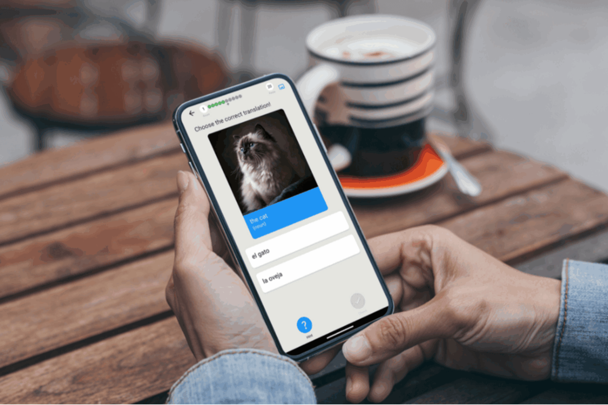
    Qlango transforms language learning into a game designed to keep you engaged and progressing. The app supports more than 50 languages from Spanish and French to Mandarin and Arabic and encourages you to think only in your target language. A built-in hint system guides you when you feel stuck so you maintain momentum instead of abandoning your studies at the first roadblock. This is also one of the most budget-friendly language-learning platforms, just $34.97 (reg. $119.99) for a lifetime subscription).

    Learn 56 languages in one app

    Science backs up Qlango’s approach that uses spaced repetition to reinforce each new word at optimal intervals boosting retention without overwhelming you. You’ll work through 6,679 essential words, each paired with example sentences that demonstrate real-world usage in business settings. Over time, the app intelligently surfaces words you struggle with most so you spend less time on familiar vocabulary and more time on high-impact terms.

    Learners progress through six difficulty levels so you can begin at a comfortable starting point and advance at your own pace. Smart recommendations help busy executives identify which chapters or modules align with specific goals such as preparing for a client presentation or drafting an international contract. This level of personalization means every minute you invest directly supports your business objectives.

    Qlango also offers flexible access on both mobile and desktop platforms so you can practice during coffee breaks commute times or between meetings.

    During this limited-time sale, it’s only $34.97 to get a Qlango Language Learning Lifetime Subscription.

    Sale ends June 1 at 11:59 p.m. PT.

    Qlango Language Learning: Lifetime Subscription (All Languages)

    See Deal

    StackSocial prices subject to change


    Source link

  • Waltz’s Use of Messaging Platform Raises New Security Questions

    Waltz’s Use of Messaging Platform Raises New Security Questions


    Michael Waltz got himself in trouble with the White House when, as national security adviser, he inadvertently added a journalist to a sensitive chat on Signal, a commercial messaging app.

    Now, as he leaves that job, he has raised a new set of questions about White House use of the encrypted app. A photograph of him looking at his phone on Wednesday during a cabinet meeting makes it clear that he is communicating with his colleagues — including the secretary of state and the director of national intelligence — using a platform originally designed by an Israeli company that collects and stores Signal messages.

    This discovery of the new system came when a Reuters photographer, standing just over Mr. Waltz’s left shoulder, snapped a photo of him checking his phone.

    He was not using a privacy screen, and when zoomed in, the photo shows a list of messages and calls from several senior officials, including Vice President JD Vance and Steve Witkoff, the special envoy who is negotiating on three fronts: the Israel-Hamas talks, the increasingly tense dance with Vladimir V. Putin about Ukraine and the Iran nuclear talks. Secretary of State Marco Rubio and Tulsi Gabbard, the director of national intelligence, are also on his chat list.

    While the app that Mr. Waltz was seen using on Wednesday looks similar to Signal, it is actually a different platform from a company that advertises it as a way to archive messages for record-keeping purposes. That is critical, because one concern that came up when senior officials were using the app was whether it complied with federal record-keeping rules.

    One of Signal’s benefits is that it is both encrypted and can be set to automatically delete messages. But while that is a feature for users seeking secure communications, it is a problem for the National Archives, as it seeks to retain records.

    It is not clear if Mr. Waltz began using the alternative app when he became national security adviser or after a nonprofit watchdog group, American Oversight, sued the government for failing to comply with records laws by using Signal.

    While the real version of Signal gets constant security updates and messages are kept encrypted until they reach a user’s phone, security experts question how secure the alternative app is.

    “This is incredibly dumb,” said Senator Ron Wyden, the Oregon Democrat who is a longtime member of the Senate Intelligence Committee. “The government has no reason to use a counterfeit Signal knockoff that raises obvious counterintelligence concerns.”

    Cybersecurity experts said the platform that Mr. Waltz was using is known as TeleMessage, which retains copies of messages, a way of complying with the government rules. The screen in the photograph shows a request for him to verify his “TM SGNL PIN.” Time stamps indicate that the communications were as recent as the morning of the cabinet meeting.

    TeleMessage, founded in Israel, was purchased last year by Smarsh, a company based in Portland, Ore.

    The TeleMessage platform accepts messages sent through Signal, and captures and archives them.

    Security experts said the use of TeleMessage raised a number of questions. Some said it appeared that the company had in the past routed information through Israel, which is renowned for its electronic spying skills.

    But a Smarsh representative said data from American clients did not leave the United States. Tom Padgett, the president of Smarsh’s enterprise business, said the collected information was not routed through any mechanism that “could potentially violate our data residency commitments to our customers.”

    Mr. Padgett also said the information was not decrypted while being collected for record-keeping purposes or moved to its final archive. Security experts said that whenever information is de-encrypted, security vulnerabilities could be introduced. “We do not de-encrypt,” Mr. Padgett said.

    Smarsh representatives took issue with the idea that their platform was a modified version of the Signal app. They said their platform simply allowed financial institutions and governments to capture communications on various channels to comply with record-keeping regulations.

    But cybersecurity officials said questions remained about how the TeleMessage platform worked, and what vulnerabilities it could introduce into Signal communications.

    Signal is built on open-source code, which allows other organizations to make their own version that uses the same encryption. But Signal Messenger, the company that makes and controls the app, does not support alternative versions and actively tries to discourage their use.

    Mr. Waltz’s use of TeleMessage was reported earlier by the publication 404 Media. According to the publication, the U.S. government contracted with TeleMessage in December 2024 to archive Signal and WhatsApp messages. Smarsh representatives said they have worked with the federal government for a decade but declined to discuss specific contracts.

    It is not clear if the U.S. government audited TeleMessage to determine how it handles the messages and whether it might break or damage the end-to-end security of Signal. Representatives of the National Security Council staff did not immediately respond to requests for comment. Smarsh representative said they allowed security audits.

    Mr. Wyden said the U.S. government and the Navy had developed secure communications tools that comply with record-keeping rules. Using the modified version of Signal is far less secure, he said.

    “Trump and his national security team might as well post American battle plans on X at this rate,” Mr. Wyden said.

    In response to reports of the photo, Steven Cheung, the White House communications director, said in a social media post that “Signal is an approved app that is loaded onto our government phones.”

    As part of the lawsuit filed by American Oversight, government officials have submitted statements saying that the Signal messages from the chat Mr. Waltz created to discuss strikes on the Houthi militia in Yemen are no longer retrievable.

    Chioma Chukwu, the interim executive director of American Oversight, said she had concerns about the use of the modified app.

    “The use of a modified Signal app may suggest an attempt to appear compliant with federal record-keeping laws, but it actually underscores a dangerous reliance on unofficial tools that threaten national security and put our service members at risk,” she said. “Americans have a right to transparency and to know their leaders are following the law, not hiding behind unauthorized workarounds.”


    Source link

  • Starbucks Adding New Staff, Says Machines Alone Won’t Cut It

    Starbucks Adding New Staff, Says Machines Alone Won’t Cut It


    Starbucks has found that removing human labor in favor of machines doesn’t work for the company — so now the coffee chain is hiring old-fashioned human baristas at thousands of stores.

    Starbucks CEO Brian Niccol stated in a call with investors earlier this week that the company’s effort to reduce headcount over the past few years and replace humans with machines had backfired: Advanced machinery proved to be an inadequate substitute for human labor.

    “Over the last couple of years, we’ve actually been removing labor from the stores, I think with the hope that equipment could offset the removal of the labor,” Niccol said on the call, per The Guardian. “What we’re finding is that wasn’t an accurate assumption with what played out.”

    By the time Niccol joined Starbucks in September 2024, the company had been testing out human staff increases at just a handful of locations. Niccol broadened the effort this year to include 3,000 locations of the coffee chain’s 40,000 stores globally.

    Related: ‘We’re Not Effective’: Starbucks CEO Tells Corporate Employees to ‘Own Whether or Not This Place Grows’

    Niccol stated that new technology alone doesn’t cut it. Starbucks needed to adequately staff stores and allow employees access to new equipment to deliver a better customer experience.

    “Equipment doesn’t solve the customer experience that we need to provide, but rather staffing the stores and deploying with this technology behind it does,” Niccol said on the call.

    Niccol noted that increasing staff would entail higher costs but asserted that “some growth” for the company would accompany the move.

    Starbucks CEO Brian Niccol. Photo by Kevin Sullivan/Digital First Media/Orange County Register via Getty Images

    The move to hire new baristas is part of Niccol’s plan to turn Starbucks around after five consecutive quarters of declining sales. Starbucks reported on Tuesday that same-store sales dropped 1% in the first quarter of 2025, falling short of Wall Street expectations.

    Related: It’s Pay-to-Stay at Starbucks As the Coffeehouse Reverses Its Open Door Policy

    Niccol reassured investors on the call that though the financial results proved “disappointing,” Starbucks was “really showing a lot of signs of progress” internally. For example, the average time to deliver in-store orders had declined by an average of two minutes during the quarter, he said.

    Niccol’s plan to turn around Starbucks includes limiting the number of items customers can order through mobile, adding ceramic mugs for in-store orders, cutting 30% of the menu, writing customers’ names down with Sharpies on their cups, and asking baristas to make orders in under four minutes. Starting May 12, Starbucks will also require baristas to dress uniformly in a solid black top and khaki, black, or blue denim bottoms.

    Starbucks operates 16,941 stores in the U.S. and has 211,000 U.S. employees. The company’s stock was down about 11% year-to-date at the time of writing.


    Source link

  • Health Connect Jetpack SDK is now in beta and new feature updates


    Posted by Brenda Shaw – Health & Home Partner Engineering Technical Writer

    At Google, we are committed to empowering developers as they build exceptional health and fitness experiences. Core to that commitment is Health Connect, an Android platform that allows health and fitness apps to store and share the same on-device data. Android devices running Android 14 or that have the pre-installed APK will automatically have Health Connect by default in Settings. For pre-Android 14 devices, Health Connect is available for download from the Play Store.

    We’re excited to announce significant Health Connect updates like the Jetpack SDK Beta, new datatypes and new permissions that will enable richer, more insightful app functionalities.

    Jetpack SDK is now in Beta

    We are excited to announce the beta release of our Jetback SDK! Since its initial release, we’ve dedicated significant effort to improving data completeness, with a particular focus on enriching the metadata associated with each data point.

    In the latest SDK, we’re introducing two key changes designed to ensure richer metadata and unlock new possibilities for you and your users:

    Make Recording Method Mandatory

    To deliver more accurate and insightful data, the Beta introduces a requirement to specify one of four recording methods when writing data to Health Connect. This ensures increased data clarity, enhanced data analysis and improved user experience:

    If your app currently does not set metadata when creating a record:

    Before

    StepsRecord(
        count = 888,
        startTime = START_TIME,
        endTime = END_TIME,
    ) // error: metadata is not provided
    

    After

    StepsRecord(
        count = 888,
        startTime = START_TIME,
        endTime = END_TIME,
        metadata = Metadata.manualEntry()
    )
    

    If your app currently calls Metadata constructor when creating a record:

    Before

    StepsRecord(
        count = 888,
        startTime = START_TIME,
        endTime = END_TIME,
        metadata =
            Metadata(
                clientRecordId = "client id",
                recordingMethod = RECORDING_METHOD_MANUAL_ENTRY,
            ), // error: Metadata constructor not found
    )
    

    After

    StepsRecord(
        count = 888,
        startTime = START_TIME,
        endTime = END_TIME,
        metadata = Metadata.manualEntry(clientRecordId = "client id"),
    )
    

    Make Device Type Mandatory

    You will be required to specify device type when creating a Device object. A device object will be required for Automatically (RECORDING_METHOD_AUTOMATICALLY_RECORDED) or Actively (RECORDING_METHOD_ACTIVELY_RECORDED) recorded data.

    Before

    Device() // error: type not provided
    

    After

    Device(type = Device.Companion.TYPE_PHONE)
    

    We believe these updates will significantly improve the quality of data within your applications and empower you to create more insightful user experiences. We encourage you to explore the Jetpack SDK Beta and review the updated Metadata page and familiarize yourself with these changes.

    New background reads permission

    To enable richer, background-driven health and fitness experiences while maintaining user trust, Health Connect now features a dedicated background reads permission.

    This permission allows your app to access Health Connect data while running in the background, provided the user grants explicit consent. Users retain full control, with the ability to manage or revoke this permission at any time via Health Connect settings.

    Let your app read health data even in the background with the new Background Reads permission. Declare the following permission in your manifest file:

    <application>
      <uses-permission android:name="android.permission.health.READ_HEALTH_DATA_IN_BACKGROUND" />
    ...
    </application>
    

    Use the Feature Availability API to check if the user has the background read feature available, according to the version of Health Connect they have on their devices.

    Allow your app to read historic data

    By default, when granted read permission, your app can access historical data from other apps for the preceding 30 days from the initial permission grant. To enable access to data beyond this 30-day window, Health Connect introduces the PERMISSION_READ_HEALTH_DATA_HISTORY permission. This allows your app to provide new users with a comprehensive overview of their health and wellness history.

    Users are in control of their data with both background reads and history reads. Both capabilities require developers to declare the respective permissions, and users must grant the permission before developers can access their data. Even after granting permission, users have the option of revoking access at any time from Health Connect settings.

    Additional data access and types

    Health Connect now offers expanded data types, enabling developers to build richer user experiences and provide deeper insights. Check out the following new data types:

      • Exercise Routes allows users to share exercise routes with other apps for a seamless synchronized workout. By allowing users to share all routes or one route, their associated exercise activities and maps for their workouts will be synced with the fitness apps of their choice.

    Fitness app asking permission to access exercise route in Health Connect

      • The skin temperature data type measures peripheral body temperature unlocking insights around sleep quality, reproductive health, and the potential onset of illness.
      • Health Connect also provides a planned exercise data type to enable training apps to write training plans and workout apps to read training plans. Recorded exercises (workouts) can be read back for personalized performance analysis to help users achieve their training goals. Access granular workout data, including sessions, blocks, and steps, for comprehensive performance analysis and personalized feedback.

    These new data types empower developers to create more connected and insightful health and fitness applications, providing users with a holistic view of their well-being.

    To learn more about all new APIs and bug fixes, check out the full release notes.

    Get started with the Health Connect Jetpack SDK

    Whether you are just getting started with Health Connect or are looking to implement the latest features, there are many ways to learn more and have your voice heard.

      • Subscribe to our newsletter: Stay up-to-date with the latest news, announcements, and resources from Google Health and Fitness. Subscribe to our Health and Fitness Google Developer Newsletter and get the latest updates delivered straight to your inbox.
      • Check out our Health Connect developer guide: The Health and Fitness Developer Center is your one-stop-shop for building health and fitness apps on Android – including a robust guide for getting started with Health Connect.
      • Report an issue: Encountered a bug or technical issue? Report it directly to our team through the Issue Tracker so we can investigate and resolve it. You can also request a feature or provide feedback with Issue Tracker.

    We can’t wait to see what you create!


    Source link